The big news this week—though widely anticipated—was the 4.9% annualized growth of the economy in the third quarter. Analysts still infected by Phillips Curve thinking worried that a strong economy would encourage the Fed to keep rates “higher for longer,” thus posing the risk of a recession next year. (Note: economic growth does not cause inflation. In fact, over the past year the economy has continually beat growth expectations, all the while inflation has been declining rather significantly.) By week’s end, worries about Middle East tensions trumped growth fears, and inflation data showed that disinflation, not inflation, remains the order of the day. Interest rates backed off their highs, and equities traded lower. Expect Phillips Curve nightmares to continue to haunt the market this coming week. As for Middle East tensions, well, that merits concern but I don’t know of any obvious solution to that.
Chart #1
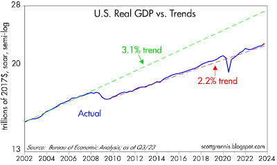
While 4.9% growth in one quarter certainly stands out as a big number, it’s worth noting that it’s an annualized number. In fact, the economy reportedly grew only 1.2% in the third quarter. And as Chart #1 shows, the path of real GDP (blue line) experienced only a small wiggle to the upside with this latest number. The big story with GDP is that the economy has been growing by more or less 2.2% since mid-2009. That’s a lot slower than the 3.1% trend which prevailed from 1965 through 2007. Today, the U.S. economy is unfortunately not in danger of growing too fast. It is just muddling along, fighting the headwinds of very high tax and regulatory burdens aggravated by excessive government spending on transfer payments and “green” energy boondoggles (green energy needs subsidies to compete since it’s woefully inefficient).
Chart #2
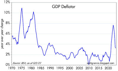
Chart #2 shows the year-over-year change in the GDP deflator, which is the broadest measure of inflation we have. By this measure, inflation has fallen from a high of 7.7% to now 3.2%.
Chart #3
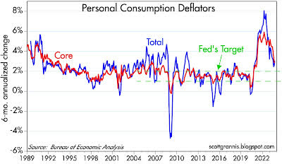
Chart #3 shows the 6-mo. annualized rate of change of the Personal Expenditures Consumption Deflator and its core (ex-food and energy) version (note: the PCE deflator is a better measure of inflation than the CPI because the weights of its components change dynamically as consumer habits change). Over the past six months, both of these measures show inflation rising at a 2.8 – 3.2% annual rate, only about 1 percentage point faster than the upper end of Fed’s target.
Chart #4
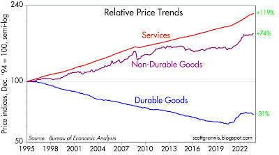
Chart #4 breaks down the Personal Consumption Deflator into its 3 main categories. Note the impressive decline in durable goods prices which began in 1995, the year China first opened its economy to world trade. Most of the increase in inflation in recent decades comes from the service sector, which in turn reflects mostly wages. The huge increase in wages alongside a significant decline in durable goods prices means that an hour’s worth of work today buys more than 3 times as much in the way of durable goods as it did in 1995. We’ve never before seen such an increase in purchasing power; prior to 1995, durable goods prices never declined on a multi-year basis.
Chart #5
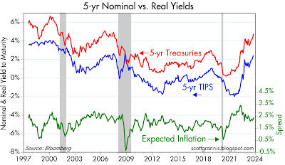
Chart #5 shows real and nominal yields on 5-yr Treasuries and the difference between the two (green line), which is the market’s expectation for what CPI inflation will average over the next 5 years. The rise in yields over the past 18 months has been driven almost exclusively by the rise in real interest rates. Real rates, in turn, are the best measure of how tight monetary policy is. Thus, tight money (as measured by a 340 bps rise in real yields) has brought inflation expectations down to about 2.3%, which is almost exactly the upper bound of the Fed’s target for PCE inflation (2%), because the CPI tends to exceed the PCE deflator by about 30-40 bps per year.
Chart #6
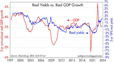
Chart # 6 compares the level of real yields on 5-yr TIPS to the 2-yr annualized growth of GDP (which I use because it smooths out the random quarterly variations in actual GDP growth, and it likely mimics the public’s perception of what current GDP growth is). Real yields tend to track the strength or weakness of the economy; high real yields prevailed in the late 1990s when the economy was exceptionally strong (growth rates of 4-5%), and real yields have been low during most of the past decade as the economy has averaged 2% annual growth. With the exception of the past 18 months, of course, when real yields have surged. If the economy remains on a 2.2% growth path, it wouldn’t be unreasonable to expect that real yields will decline significantly from today’s 2.4% levels. That would likely coincide with a relaxation of the Fed’s monetary stance, and that, in turn, would provide welcome relief to the market.
Original Post
Editor’s Note: The summary bullets for this article were chosen by Seeking Alpha editors.
Read the full article here


